A New Freeware IWAD Project for DooM
A New Freeware IWAD Project for DooM
|
|
|
|
Here is some of the work that has been done on T.P.D. so far:
Work of T.P.D. is still in its very early stages, which means that there really isnt much to show.At this time, much of the work has been put into creating place keepers, graphics, sounds, and lumps that are meant to take the place of the existing entries in the DooM IWAD until better entries can be made. As one might imagine, these place keepers do not look all that good, as they are only meant to be temporary.
First, here's a quick look at some of the place keeper graphics.
All textures and flats are currently a grey stucco:
The sprites for all ground based objects are pink pawns:
The sprites for objects that hang from the ceiling are pink lollipops:
All walking monsters are now pink mannequins, ...
... and all flying monsters are pink pac men:
There is currently a simple grey status bar, with a smiley face for the player:
The red L.E.D. display isn't half bad, and may find its way into the final IWAD if it is lucky.
Keys, weapons, and ammunition are all represented by words, and there are a few simple graphics for power ups. Barrels are now pink barrels, and dead monsters leave pink tombstones behind when they die.
Some players may be amused by the fact that a fart sound is being used as a place keeper for most of the game sounds.
Please keep in mind that all of these graphics and sounds are just temporary, and are not meant to be part of the final version of the game.
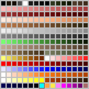
On a more interesting note, T.P.D. already has its own palette and colour map.
Before looking at the new palette, let's take a look at the original palette used by DooM. This palette is extremely effective in DooM, but it suffers from a few problems, which frustrates many DooM modders.
The top row of the DooM palette contains five browns, four greens, and seven greys, including black and white. These colours, except for white, are dark, and many modders have difficulty distinguishing between them (At least I do.).
There is large number of pinks on the DooM palette, which is used primarily by the pink demon, and by a few hell textures. It is really not necessary to have so many pinks, and the extra space could have been used for other colours.
The range of yellows is not very good, and, much to the frustration of many modders trying to make sprites and graphics, there is only a tiny number of magentaish purples on the palette.
White appears four times on the palette. One shade of red, and one shade of blue each appear twice as well.
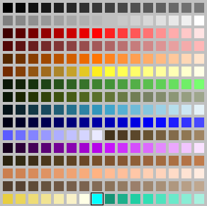
T.P.D.'s palette is more varied, and has been designed to address many of the problems. Let's take a look at it, shall we?
Rows 1 and 2 contains the grey range, including black and white (colours 031). The number of greys has been reduced slightly on the new palette from 39 to 32. This change should not be noticeable to anyone.
Row 3 of the palette includes the red range, which has been reduced from 23 to 16 (colours 3247). Again, this is not a dramatic change.
Row 4 contains the much reduced pink range (colours 4863). The pinks are not all that heavily used, so I decided to cut the range in half. I don't think the extra pinks will be missed.
Row 5 contains the oranges (colours 6479). This range starts darker than the range used in the DooM palette, which should make it more useful.
Row 6 is yellow (colours 8095). The yellows fade to something of a dark orange, which should make this range good for fires and explosions.
Row 7 is a range of greens that are almost identical to the ones used on the DooM palette (colours 96111).
Row 8 is a range of khaki greens (colours 112127). These should be highly useful for characters in military uniforms and for military vehicles.
Row 9 is a range of sky blues (colours 128143).
Rows 10 and 11 contain a range of royal blues, similar to the ones used by the DooM palette (colours 144167). Row 11 is completed by a range of browns, similar to browns on the DooM palette (colours 168175).
Row 12 contains the long awaited purple range (colours 176191).
Rows 13 and 14 reproduce the range of colours used for flesh tones on the DooM palette (colours 192223).
Row 15 is the range of tans (colours 224239).
Row 16 begins with yellows (colours 240246). These yellows are more golden than lighter yellows in row 6, and may be useful for fires and whatnot. Colour 247 is cyan, which is used for transparent areas. Row 16 is completed by a slightly more aqua range of greens (colours 248255)
I think this is a fairly good palette, which should serve myself, and the other folks working on T.P.D. very well. This is not necessarily the final version of the palette, however, and it may undergo some changes in the future, depending on the needs of the project.
Note: Colour 176, the darkest purple, has been changed since the above copy of the palette was done. This was because of a problem the dark colour created with the automap in DooM Legacy. Hopefully, the palette will be able to be restored at some point in the future.
Okay folks.It may not seem like anything has been happening since November. Work on TPD has kind of been on the back burner because of another project, The Ultimate Chex Quest, but some work has been going on.
In an effort to create better looking sprites, it has been decided that stop motion animation will be used to create the sprites for the majority of the enemy sprites. So far, two excellent enemy designs have been created by Chris Mallis. One of the designs has already been translated into a physical model for the stop motion work.
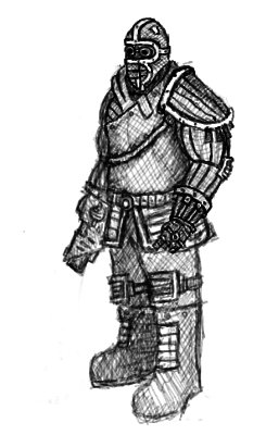
Chris Mallis's design for the trooper / sergeant.
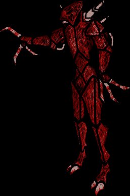
Chris's nasty design for the imp.
|
|
|
|